Aurelia Beauty Atelier
For Aurelia, previously known as Sarah Jane Beauty, I created a new brand strategy and visual identity. Sarah Jane wanted something with a highly-romantic art nouveau appeal.
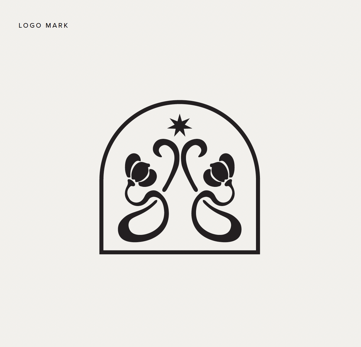
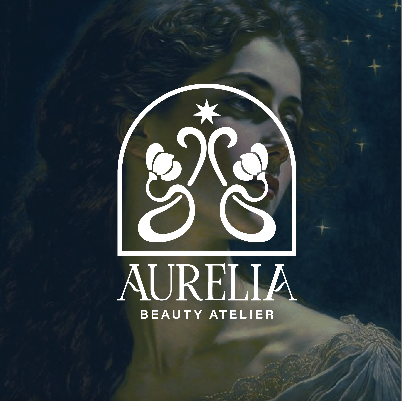
Aurelia's logo is all about the powerful but gentle divine feminine. The arch is one of my favorite shapes to use – it represents strength, sturdiness, and the ability to carry enormous weight. Curvy and symmetrical, this logo was designed to appeal to a female demographic. Symmetrical logos create a sense of balance and calm and add visual organization to the brand.
ROLE: BRAND CREATIVE DIRECTOR
Projects:
Visual identity
GTM launch planning, positioning & messaging
Website design